
Joshua Kranefeld
UI & UX Designer
In this blog you will find lots of useful tips, tricks and explanations that will help you become a better designer.
Discover more content
You want to try?
Save time?
You need help?
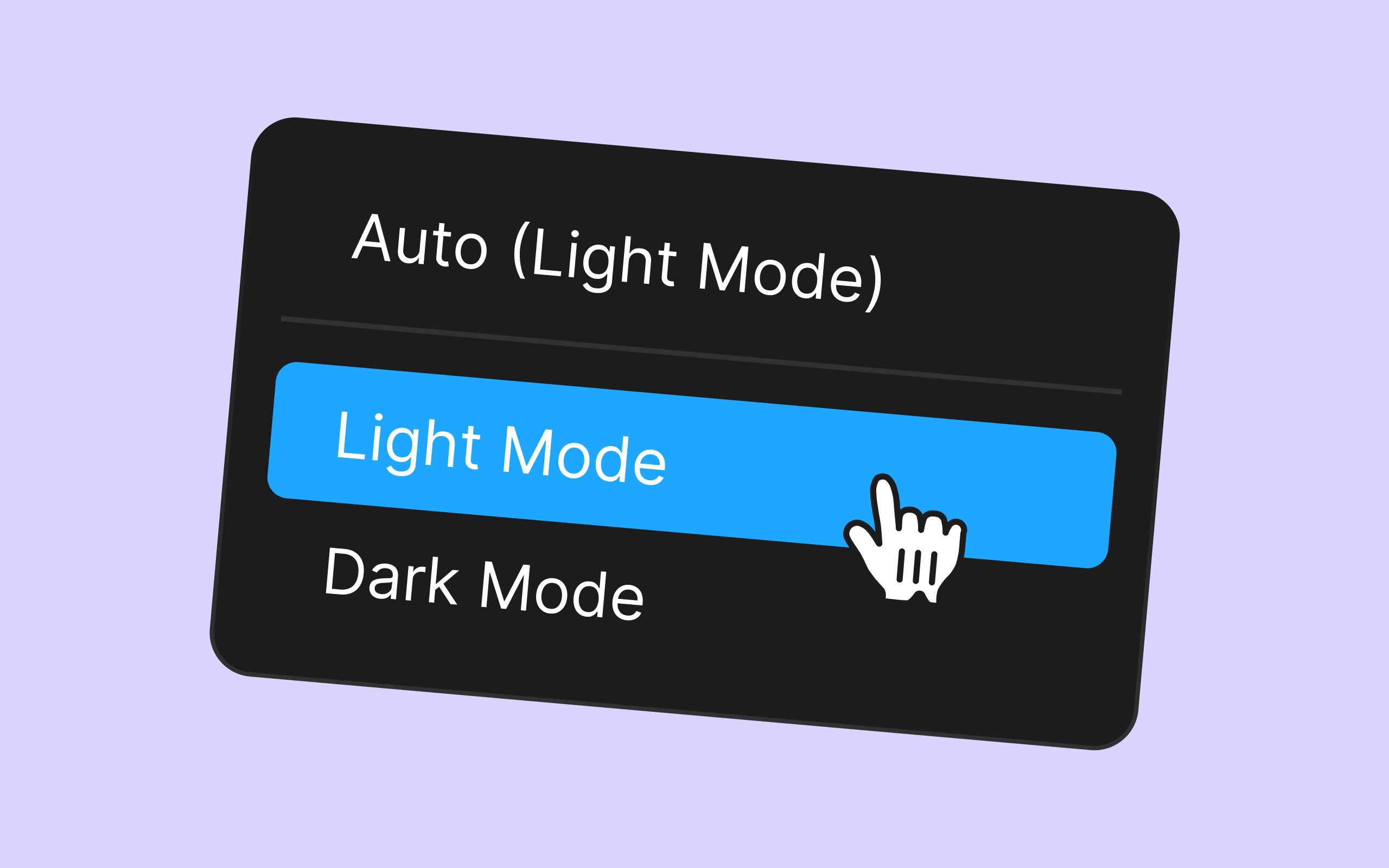
Overloading Short-Term Memory
You can edit 8 Components for free. Get premium for unlimited access.
In this article, we'll explore the significance of not overtaxing users' short-term memory in app design and how it can enhance the overall user experience.
1. Understanding Short-Term Memory
In the realm of app design, simplicity is often seen as the ultimate sophistication. But what's the underlying cognitive science behind this principle? Short-term memory, a fundamental component of human cognition, plays a pivotal role in user interactions with digital products. In this article, we'll explore the significance of not overtaxing users' short-term memory in app design and how it can enhance the overall user experience.
Image Description
2. Understanding Short-Term Memory
Short-term memory is like the mental workbench where we temporarily store and manipulate information. It's where we juggle numbers in mental arithmetic or remember a phone number just long enough to dial it.
2.1 The Cognitive Workbench
Short-term memory is like the mental workbench where we temporarily store and manipulate information. It's where we juggle numbers in mental arithmetic or remember a phone number just long enough to dial it.
2.2 Limited Capacity
The key aspect to remember is that short-term memory has a limited capacity. Cognitive psychologist George A. Miller famously proposed that it can hold about seven (plus or minus two) chunks of information at once.
Image Description
3. Why Overloading Short-Term Memory is a UX Sin
Overloading short-term memory creates cognitive load, a measure of mental effort required for a task. High cognitive load can lead to frustration, reduced efficiency, and abandonment of tasks.
3.1 Cognitive Load
Overloading short-term memory creates cognitive load, a measure of mental effort required for a task. High cognitive load can lead to frustration, reduced efficiency, and abandonment of tasks.
3.2 Recognition vs. Recall
Users prefer recognition over recall. Designing apps that rely on recognition (where options are presented) rather than recall (where users must remember information) eases cognitive burden.
3.3 Efficient Navigation
In-app navigation should be designed to minimize memory load. Users shouldn't have to remember where they've been or what they've seen; the interface should guide them effortlessly.
Image Description
4. Strategies to Minimize Short-Term Memory Load
Chunking involves grouping information into manageable "chunks." For instance, presenting a phone number in sets of three or four digits is more memory-friendly than a continuous string of numbers.
4.1 Chunking
Chunking involves grouping information into manageable "chunks." For instance, presenting a phone number in sets of three or four digits is more memory-friendly than a continuous string of numbers.
4.2 Progressive Disclosure
Don't overwhelm users with all information at once. Use progressive disclosure to reveal information gradually, as needed.
4.3 Consistency and Familiarity
Design elements, such as icons and symbols, should be consistent throughout the app, reducing the need for users to remember what each symbol means.
4.4 Effective Signposting
Clear signposts and navigation aids help users maintain context, reducing memory strain.
Similar articles


Discover more content
You have questions or need help?
You want to try?
Save time and money?